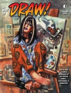
The Best Of Draw! Volume Three (book review).
Back in the day, when a significant magazine of theirs sold out, TwoMorrows reprinted its material in collected volumes, as with Draw! As its editor, Mike Manley, points out in the introduction, there is no age or shelf life to drawing techniques. As I had the first two volumes, I picked this one up, ‘The Best Of Draw! Volume Three’, collecting issues 5-7, mostly to collect the set, although I do have #7. Let’s pick out some of the critical bits.
The opening is an interview with Mike Wieringo (1963-2007) and a lot of his art. I did wonder at how clear his pencil work was until he explained he sketched panels separately and lightboxed the line work onto Bristol board so the construction lines were removed for the inker. Hardly surprising that each page took so long to prepare. I’m less sure about it being a technique many comic book artists would like to emulate, mostly because of the time spent redrawing all the time, but it does give some insight.
Artist Paul Rivoche spent time going over perspective and, apart from one example, shows the difference between getting it right and wrong. Oddly, the example where he shows all the mistakes is the one that I wish he showed correctly as a comparison. He doesn’t quite beat Andrew Loomis with this, but he comes pretty close. All good comic book artists have to be good draughtsmen/women, so I hope you have the right equipment to lay the lines in correctly.
Artist Brett Blevins shows not only how to draw good hands but also a sharp reminder of how they can vary from person to person.
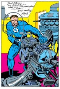
Artist Paul Rivoche is back addressing the problems of room building with some useful lessons. I know it’s something I take for granted, but I do have a general understanding of plumbing and electricity and how a building, let alone a room, works. I like his lesson of telling artists to memorise rooms when out and then recreate them on paper at home. A lot of it is down to functionality, and if you grasp that, then that’s half the battle. If you look at the Kirby approach to technology, it looks functional, so you find it harder to question how. I remember a Kirby 1960s pin-up of Mr Fantastic with a footnote by Stan Lee saying he doesn’t know what the device is, but loving it says it all. Although Rivoche doesn’t use this as an example, I’ve found the pin-up online to show what I mean.
The interview with storyboard and cartoonist Bill Wray shows an odd apprenticeship of inking and helping others when needed. Although I doubt if I would be a fan of his art, he does provide some insight into his career.
Illustrator Celia Calle is interviewed by editor Mike Manley about how she moved from fashion design advertising to the odd comic book cover. She also had a learning experience moving from paper to digital, although she still used the former for the basic design. Some of the information she gives, especially when it comes to scanning resolution and using greyscale, should help novices avoid some problems when enlarging on screen and finding their pencil lines are far thicker than they should be. Rather interestingly, using a Mac, she likes using Painter for initial stages before going into Photoshop, although she thinks there are too many options. Presumably, this is still true 20 years later.
On his own, Mike Manley gives inking tips. Having seen later issues of ‘Draw!’, it is apparent that American manufacturers are using cheaper materials to keep costs down. You would think they would talk to the pros who use their products to ensure they supply what is really wanted. He noted that when a pen or brush was dependable and durable, the number of purchases decreased. Digital drawing and painting now has also been critical to these pens and brushes then, as even more so now.
The interview with cartoonist Stephen de Stefano has similarities to the Bill Wray interview, but it does point out that art skills can be brought to any medium.
I’m more amazed that artist Brett Blevins discusses light and shadow and avoids the word chiaroscuro, which describes it. Saying that he gives ample demonstration between realistic drawing and the simplification needed for comic book work. Saying that, the factory process of inking and colouring by others and the needs of time and printing also contribute to a need for shortcuts.
Paul Rivoche further explores designing buildings and rooms. It should come as no surprise that when these original three issues were published, there was a need to emphasise the techniques. Here it is more to do with understanding what you’re looking at and practice to incorporate reality to make something look believable no matter how outlandish it is.
Brett Blevins argued the case for practice sketching that can be missed by the pros. I take his point but can give a counterargument. I can and have done a great character sketch in pen and could never reproduce it at a larger size. I understand your concern about sacrificing the precision of your lines and reserving them for critical areas. Mind you, it does mean I ought to consider a light box or scanning into the computer for enlargement. Even so, drawing to capture something for possible future use shouldn’t be underestimated.
Artist Dan Brereton gives his history and art technique, and a piece of his art is on the cover. He was a lot younger back then and confesses to being a night owl when doing his work. I’ve only heard of a few artists, like Dave Cockrum, doing such a practice, so it’s clearly not for everyone. It does make me wonder how they can look at their work in a natural light. In painting that must be tougher. Nevertheless, he also gives a demonstration of his painting technique. His ambition at the time was to tighten his work, and looking nearly 20 years later, without seeing the dates of his work, it looks like he has made progress in that respect.
For the last piece in this volume, artist Paul Rivoche looks at the application of shadows to buildings. I did wonder if this was another case of chiaroscuro. Knowing where the main light source is in a picture and how it affects the shapes is what gives the dimensions. It’s also one thing a non-artist will recognise as looking wrong when it’s missed because it is so ingrained. The artist must realise this and not overlook it.
Early issues of ‘Draw!’ rarely pop up online. The three volumes of reprints likewise, but there’s a fair bet that the pro-artists have them on their shelves, as they are art technique books, studied as they develop as artists and kept for inspiration. If you’re in that mix, a volume will combine the best under one cover, so keep vigilant.
GF Willmetts
April 2025
(pub: TwoMorrows Publishing, 2008. 253 page illustrated softcover. Price: varies. ISBN: 978-1-893905-91-7. Direct from them, you can get it for $12.00 (US))
check out websites: www.TwoMorrows.com and https://twomorrows.com/index.php?main_page=product_info&cPath=98_59&products_id=637


